|
|
||
|
||
|
Introduction To create bar charts and pie charts that graphically display relationships within your data, you can use the GCHART procedure within SAS/GRAPH software. You can create charts to display
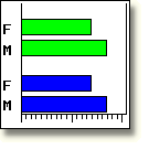
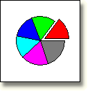
To view a larger version of a bar or pie chart, select an image. |
|
Bar Chart |
Pie Chart |
|
This lesson shows you how to create basic horizontal bar charts, vertical bar charts, and pie charts. You also learn to specify data and statistics and to control the pattern and color in charts. |
Time to CompleteThis lesson contains pages and takes approximately 1 hour to complete. |
ObjectivesIn this lesson, you learn how to
|
PrerequisitesBefore taking this lesson, you should complete the following lessons:
|
| Copyright
© 2003 SAS Institute Inc.,
Cary, NC, USA. All rights reserved. Terms of Use & Legal Information | Privacy Statement |
|
|